The Sonos brand is dependent on the product setup experience in shaping the overall user journey and ownership satisfaction. At the time decreasing customer satisfaction scores and increasing support calls related to the existing setup process signaled that a redesign was needed.
My role was to direct and drive the redesign and overhaul of the app-based product setup, configuration and onboarding, so that it seamlessly mirrors the excellence of Sonos' physical products.
Strategy and Planning
Design & Direction
Team Lead / Management
External resource management
1 UX Architect
1 UX / UI Designer
1 User Researcher
1 PM
15 Developers
28 Months
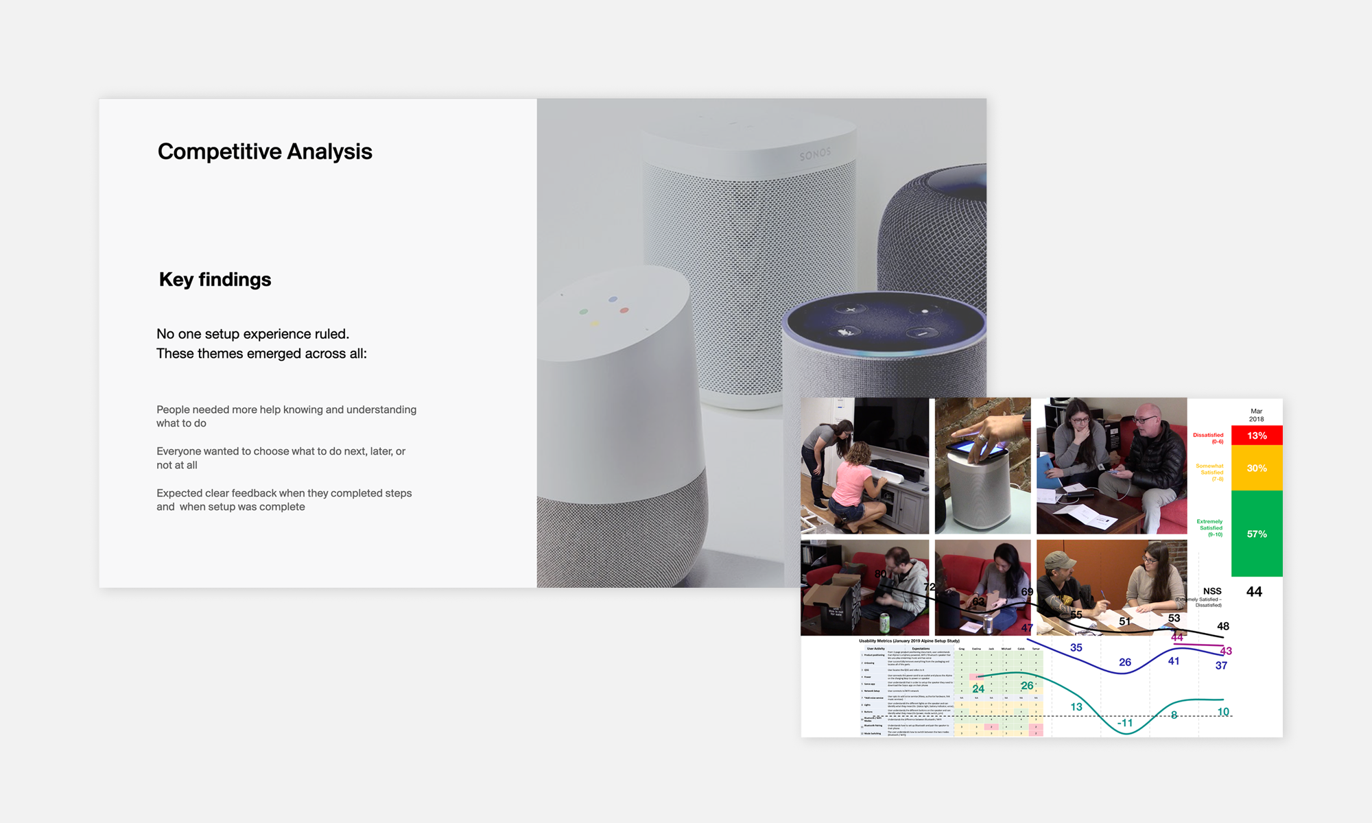
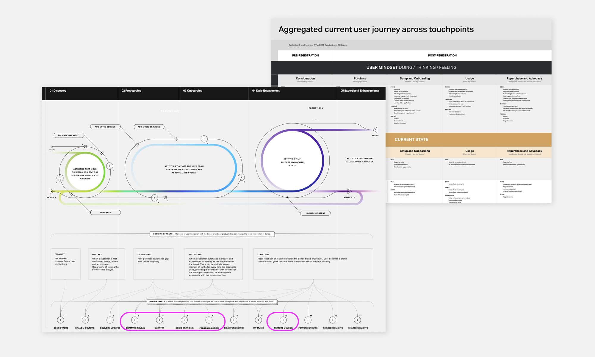
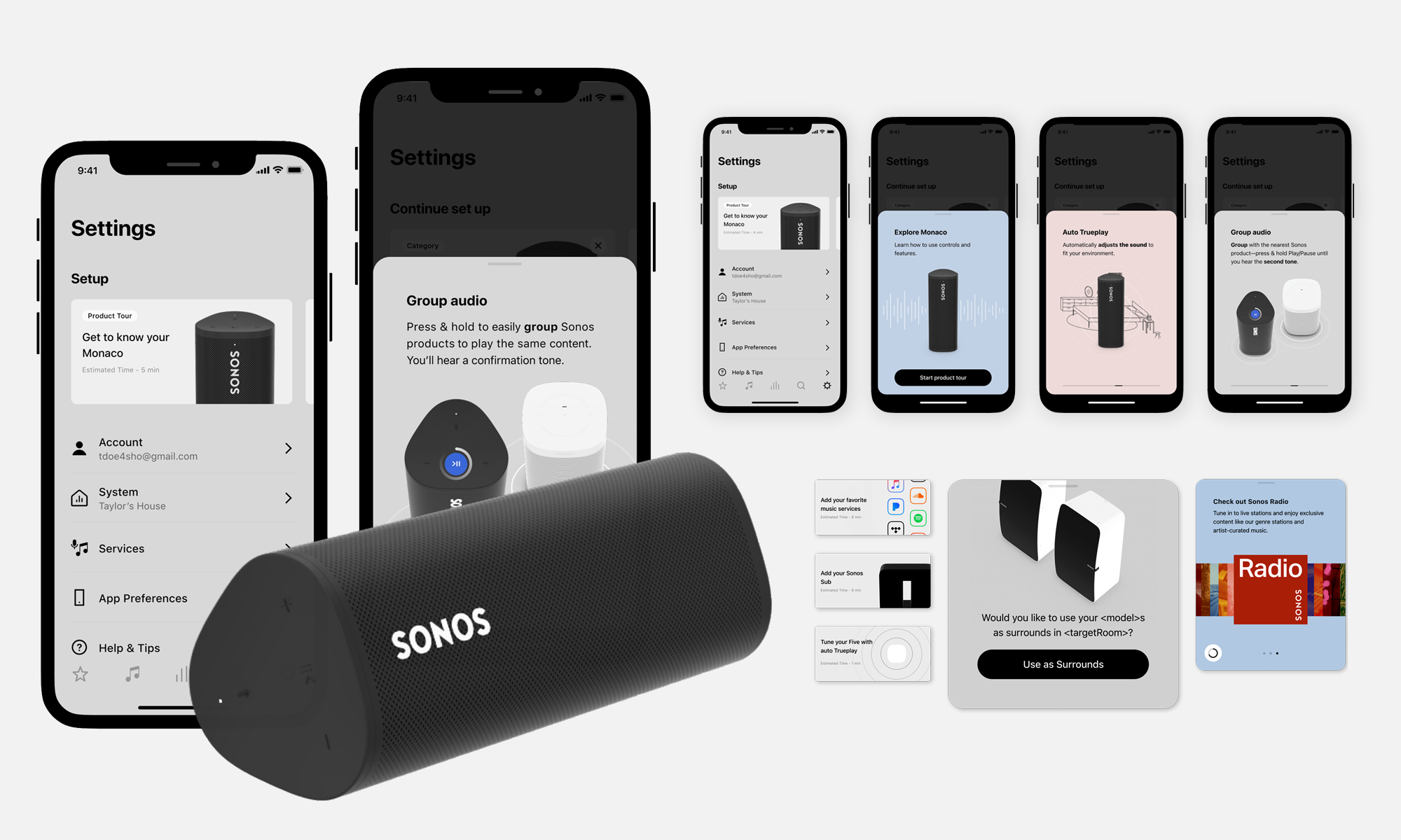
A Validated ApproachAfter comprehensive research and evaluation, including insights from users and customer service representatives, ➊ it became clear that a complete reconstruction of the setup framework was necessary to align with modern physical product experiences.
Having conducted a competitive analysis and tested experience vision prototypes, ➋ I concluded that introducing more visual and interactive elements would simplify the process, increase engagement, and create a more intuitive experience leading to higher user satisfaction.
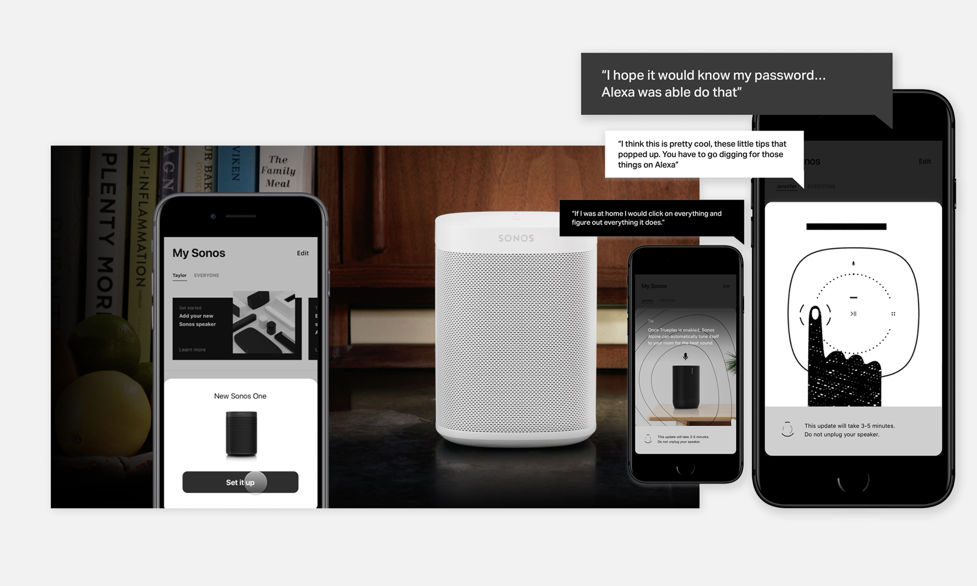
Embracing a "Show, Don't Tell" principle, I set out with the team to craft interactive, user journey specific ➌ touchpoints like visual product cards, interactive, animated setup tiles on the app home screen, and informative onboarding modules ➎ to guide users seamlessly through the setup, configuration and onboarding of the Sonos experience.
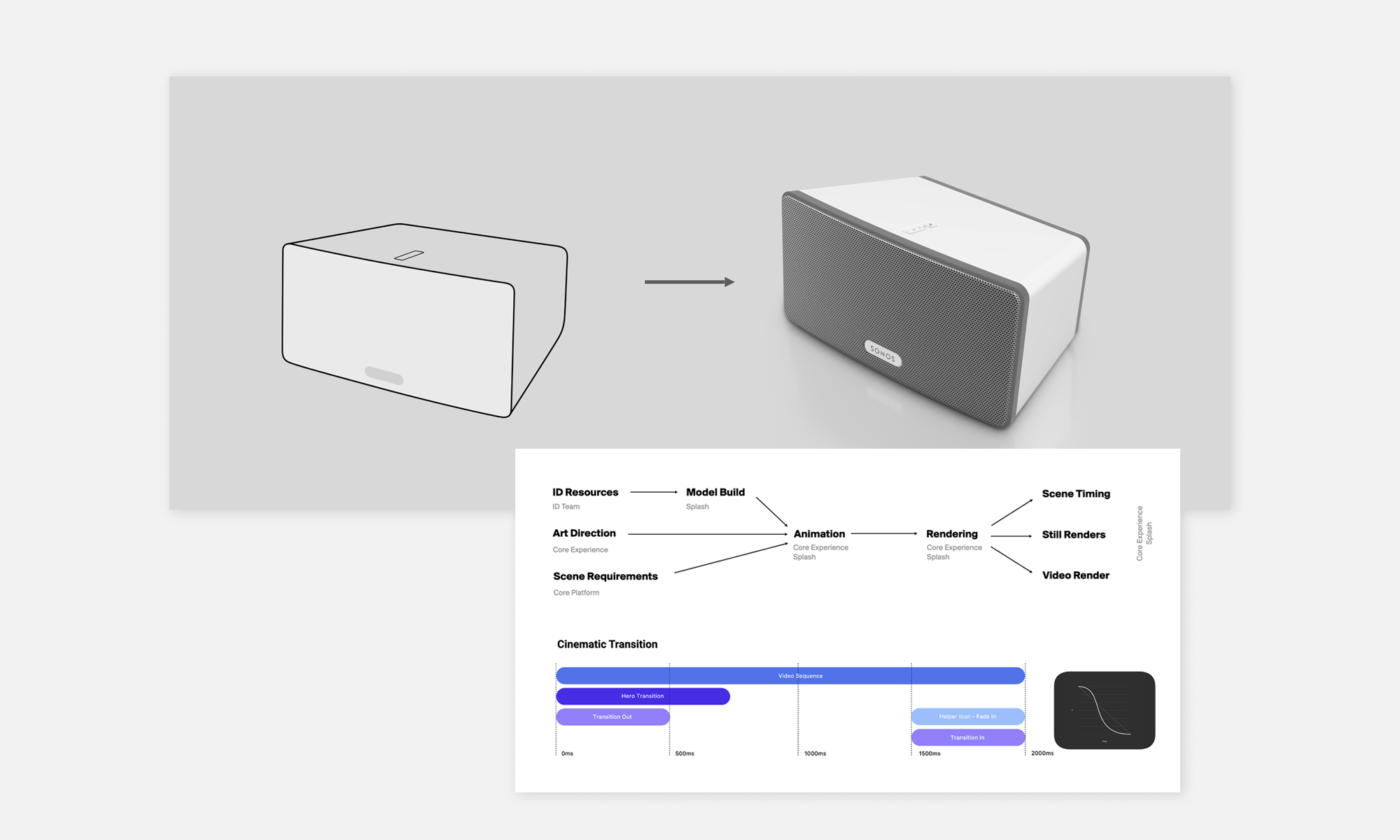
Challenges and DecisionsTo make the setup process as user-friendly and accessible as possible, we adopted a card-based model experience. This method emphasizes visual storytelling and animation, utilizing 3D models ➍ to walk users through each step of the process in an intuitive, engaging way.
To ensure broad device compatibility, I chose not to implement real-time, in-app 3D animations. Instead, we used pre-rendered video loops, which offer a visually rich experience while maintaining smooth performance across a wide range of hardware configurations—without compromising user experience.
For faster development and cross-platform deployment, we built the experience using Google’s Flutter framework. This allowed us to write shared code for both Android and iOS. However, we also had to weigh this advantage against trade-offs such as increased reliance on third-party dependencies and the limitations associated with using a non-native development environment.
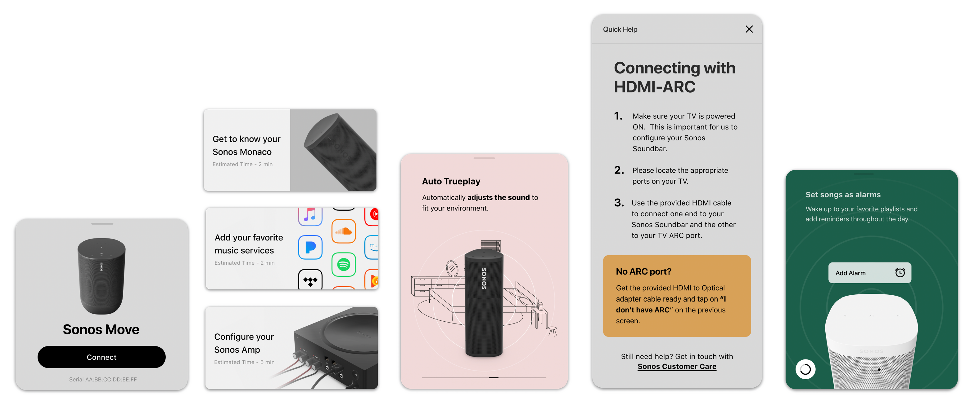
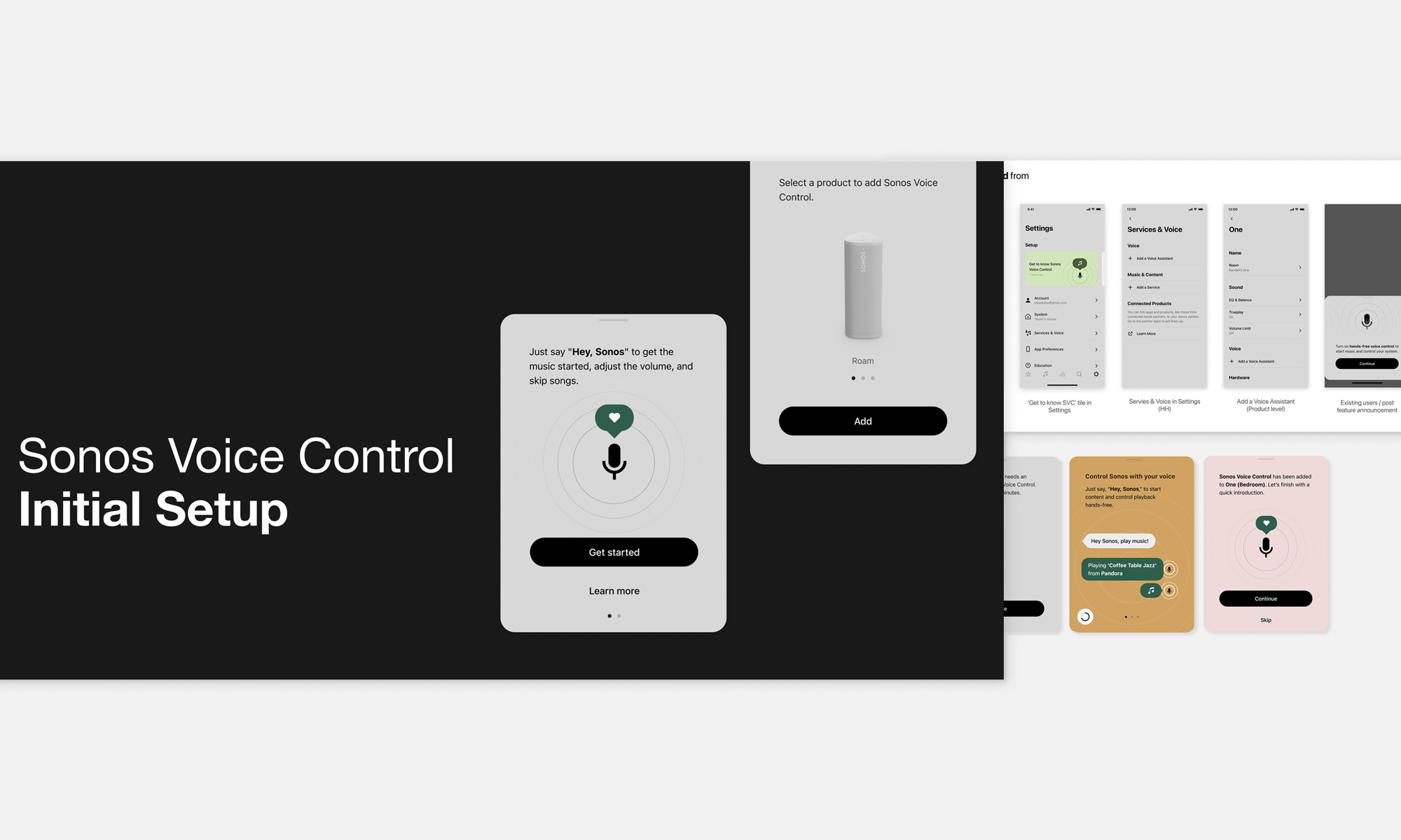
System AssemblySecondary setup workflows—including music service integration, speaker bonding and grouping, voice control ➑, and a content management system for third-party help content—were all carefully considered, designed, and integrated into a cohesive and seamless user experience.
To support this, we created detailed 3D renderings, fine-tuned animation timing, ➍ and optimized loop configurations that visually guide users through each configuration step across the entire Sonos product range.
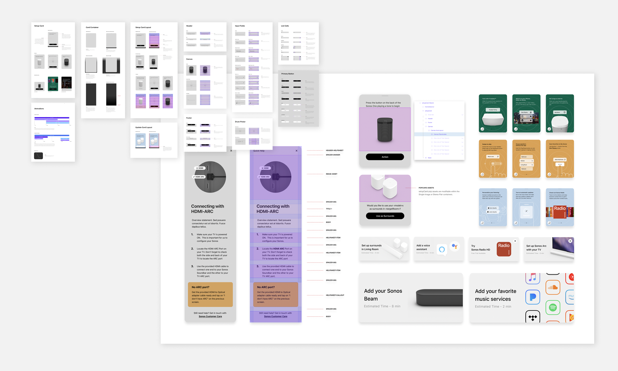
To ensure long-term consistency and scalability, we consolidated the design principles and procedural documentation into a New Product Introduction (NPI) playbook. ➏➐ This resource enables repeatable, high-quality execution for every future product launch.
TakeawaysThe project accomplished the strategic goals for a best-in-class setup experience: fast, intuitive and easy to understand, supportive of all current and forthcoming Sonos products ➒.
The user-feedback reinforced the solution we set out to deliver: a visually engaging, delightful and simple system, tailored to the audience's contextually specific needs.
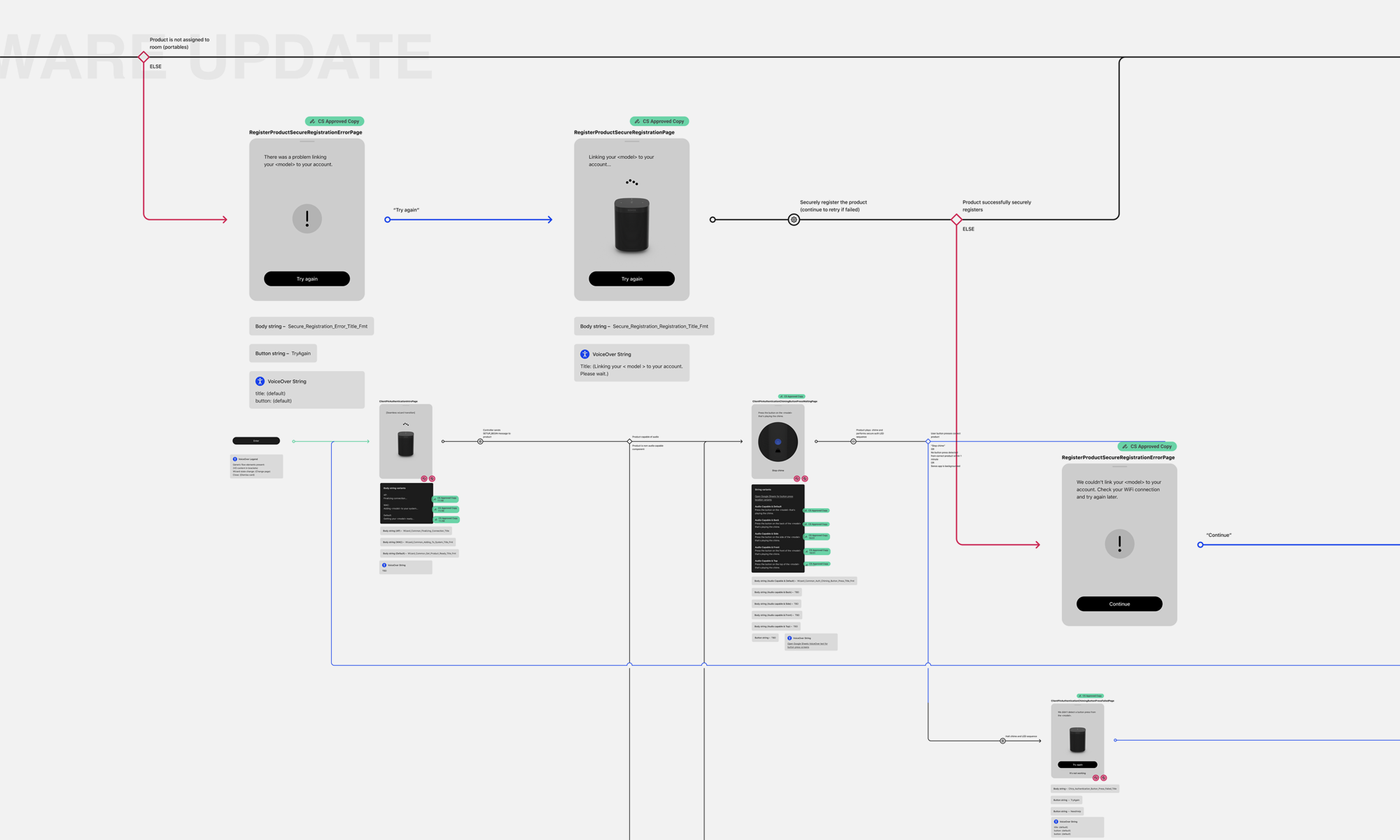
Improved user experience and setup and configuration flow; complexity greatly reduced, from 14 taps down to 4 taps for setup completion.
3% NPS increase for the new setup and config. framework launch month
System reliability, increase from 87% for the old framework, to 82% for Alpha, and 89% for Beta months. 92% reliability rating achieved during the GA month for 2,018,841 setups and resets.
"If you’re a Sonos owner, you don’t need me to tell you how easy it is to set up the company’s wireless speakers. A few taps in the Sonos app, a few button presses on the speaker, and less than two minutes later, you’re done.
But with the Roam, Sonos has simplified this process even further. No buttons to press and no passwords to enter. Every tech product should be this easy to configure."
"As is the case with all of Sonos’s wireless speakers, setting up the Roam is quite easy. As a matter of fact, the Roam is by far the simplest Sonos speaker to set up thanks to the addition of NFC. Simply open the Sonos app, tap over to settings, launch the function to add a new speaker, and the app pretty much does the rest.
The only other manual step is to tap your smartphone to the back of the Roam when the app gives you the cue. And of course, Bluetooth is even easier to set up — just turn on the speaker, hold the power button until you hear two chimes to indicate you’re in Bluetooth mode, and pair."
"Setting up the Roam in my Brooklyn apartment, the Sonos app discovered the Roam almost instantly. It then prompted me to tap my iPhone on the side of the speaker between its four feet, thus allowing the devices to identify each other using their respective NFC (near-field communication) chips. It took a couple of tries for the NFC handshake to work, but once it did, the Sonos app connected the Roam to my wireless network and automatically downloaded a firmware update.
Once that was done, the Roam was ready to go, with the whole setup process taking less than five minutes."