
The redesign of the People app and Windows personalization system was driven by a consistent 2.8 point drop in the Net Promoter Score (NPS) and aassociated decline in user engagement. Additionally, new Neon (later Fluent) design standards were recently introduced prompting the decision to redesign the app and the identity propagation system.
Business goals: introduce new features, raise engagement, improve reliability and accessibility and surface contextually relevant contacts and People data seamlessly to other apps.
Strategy and Planning
Design
Design / Creative Direction
Team Lead / Management
2 UX Designers
1 UI Designer
1 PM
10 Front/Back End Engineers
13 Months
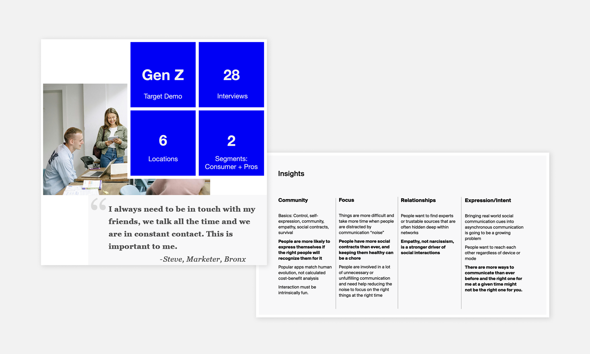
Defining the User PrioritiesI started by conducting a comprehensive study of the target demographic (Gen Z) to understand their needs, pain points, and how they use contacts within the Windows ecosystem. Conducted: 28 user interviews and surveys across six locations, targeting two user segments: consumers and professionals ➊.
User input guided our thinking along Community, Focus, Relationships, and Intent themes ➊. These insights clarified the user need for contacts within immediate reach, assistance in suggesting shared connections, and the desire for Windows to surface the right people at the right time, depending on context.
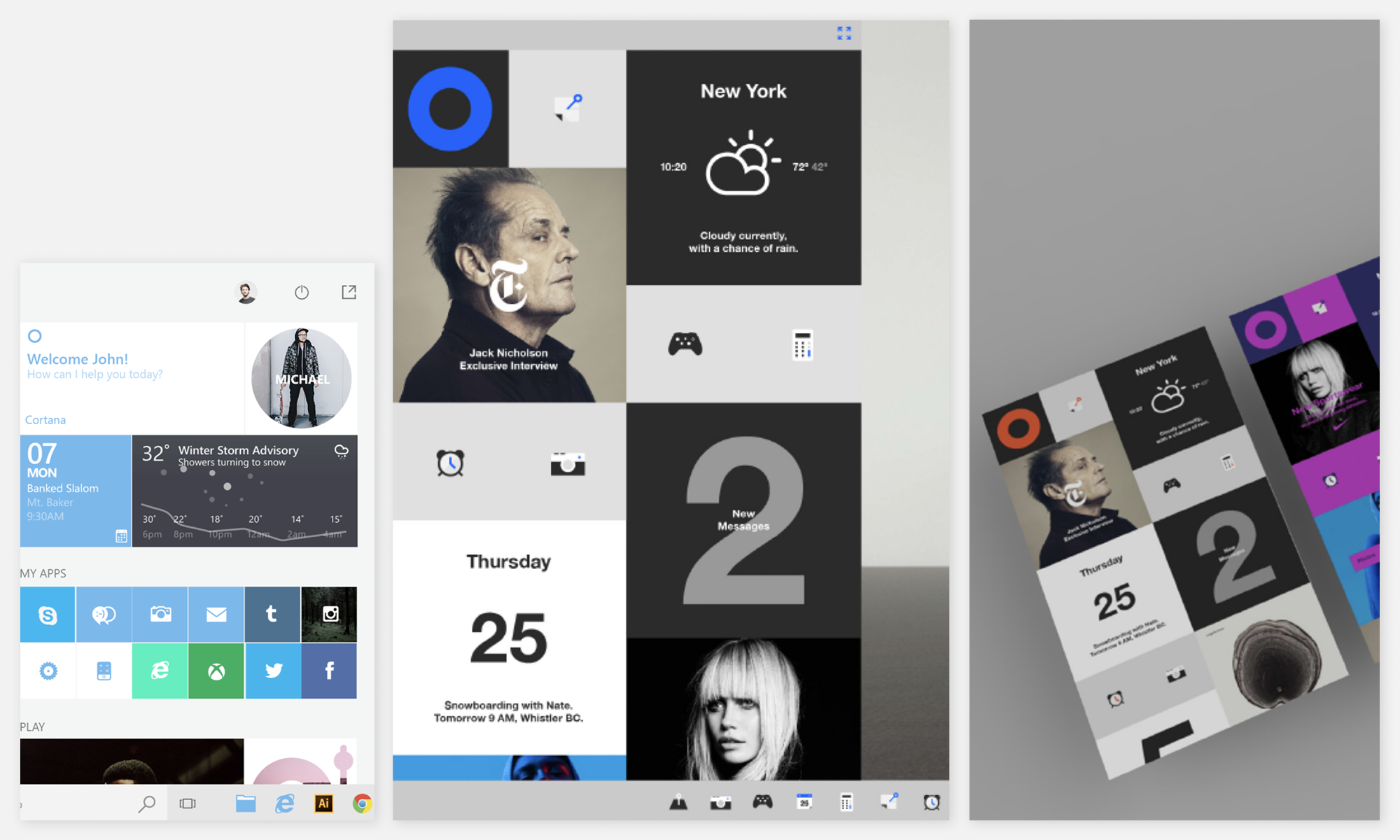
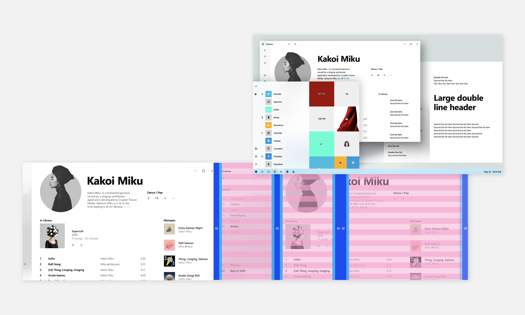
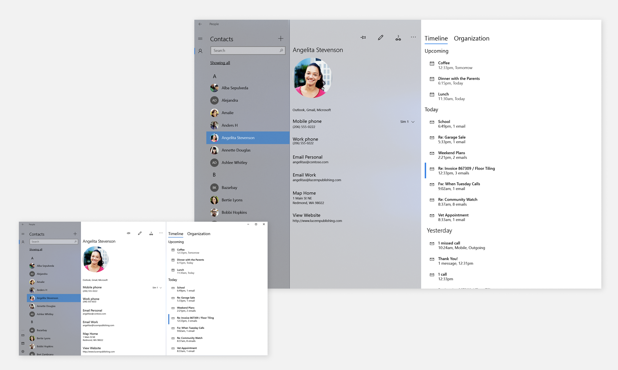
Surfaces and ScreensNext, all the screen surfaces and areas where profiles and contacts could be expressed were identified, ➋ along with functional requirements and design rules for each. This included everything from HoloLens and Edge to the Office Suite and Windows Phone.
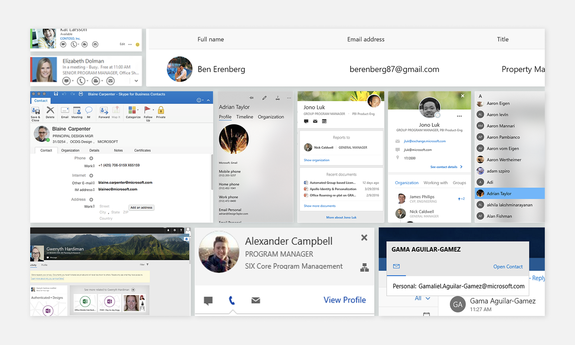
In parallel, all the elements needed for each user representation in each context (personal/professional) such as profile pictures, badges, names, titles, company information, contact options, linking requirements, URLs, and organizational charting, were identified and inventoried ➌.
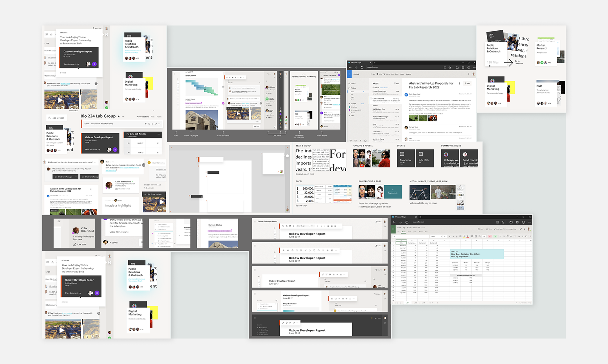
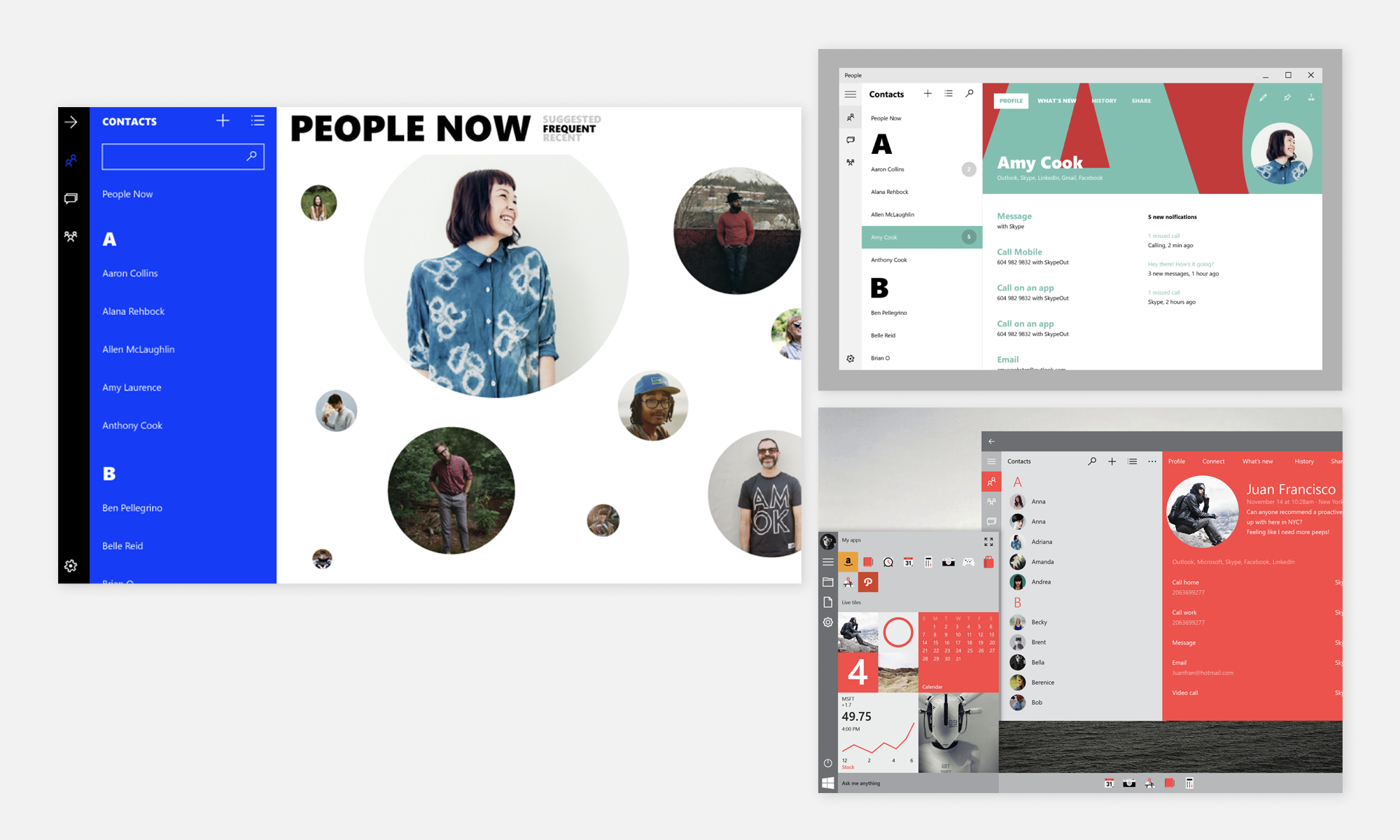
Design Exploration, Direction and ImplementationFollowing, I began a design exploration phase, considering and discarding various options. Initially, a wide range of bold concepts were explored, which were gradually narrowed down ➍➎.
Ultimately, a well-integrated option was settled on, facilitating smooth transitions between screens and apps and taking into consideration the panel model functionality and all the app operational must-haves ➏.
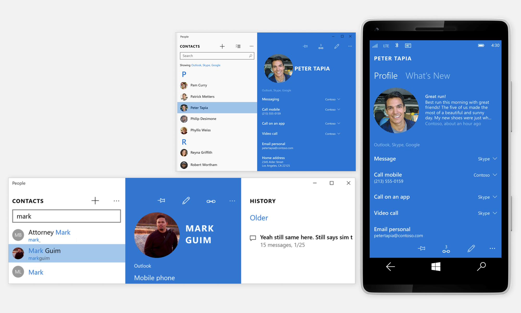
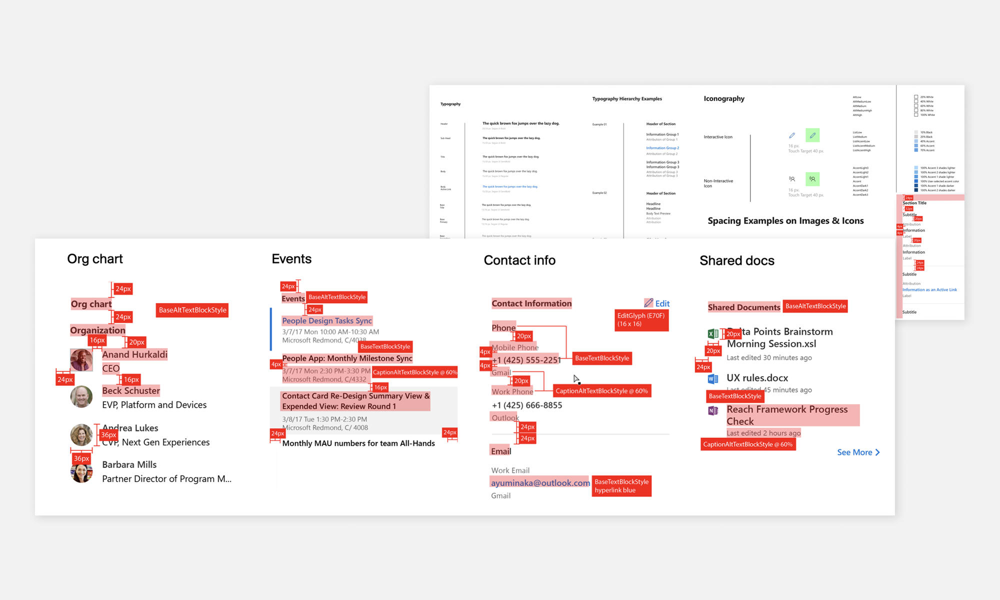
The specific functional design for various surfaces and features, such as people pinned to the taskbar, was defined, and all the application rules and style guidelines for typography and spacing were established ➐➑. The redline guidelines were documented and delivered, and we worked with the dev team on XAML front-end design integration.
FluentOnce Neon/Fluent design standards were finalized, the approach was evolved to include transparency and panel translucency levels.
Design, functionality, and onboarding methods continued to be refined, revisiting typography and the panel model to align with the new direction. ➒
TakeawaysThe project spanned an entire year and proved to be a very successful endeavor. Our focus on establishing a clear direction at start, and following up with a continuous improvement cycle, allowed us to consistently enhance the work, ensuring that our customers received the best possible experience.
See details above in our monthly status executive communication video.
18% MAU engagement Increase*
36% MAD engagement increase
240% Increased click-through rate
*Stats supplied by internal DNA team
70 Accessibility improvements
Grade B Accessibility Rating
61% faster startup time
50% fewer crashes
100+ Performance + reliability fixes
75% Fewer clicks (tabbing implemented)