
Microsoft's People Atlas was a new product Microsoft initiative aimed at enhancing creative and identity expression by leveraging the contacts in the People app and using data within the Windows Creators Edition app suite.
The business goal was driving the value of the Windows Creators Edition app ecosystem by designing and creating a new experience that connects the value propositions of creative identity, inspiration and expression.

Strategy and Planning
Design
Design / Creative Direction
Team Lead / Management
2 UX Designers
1 UI Designer
1 PM
10 Front/Back End Engineers
10 Months
Understanding our UsersI started the process with conducting user research across the East and West coasts to understand the drivers, methods, and values creators placed on identity and sharing ➊. Through interviews and surveys, key insights emerged: creators valued authenticity online and offline, control over messaging and identity curation, and a strong desire for creative collaboration and sharing ➊
With these insights collected, we identified opportunities to extend traditional social media actions into creative inspiration and collaboration spaces.
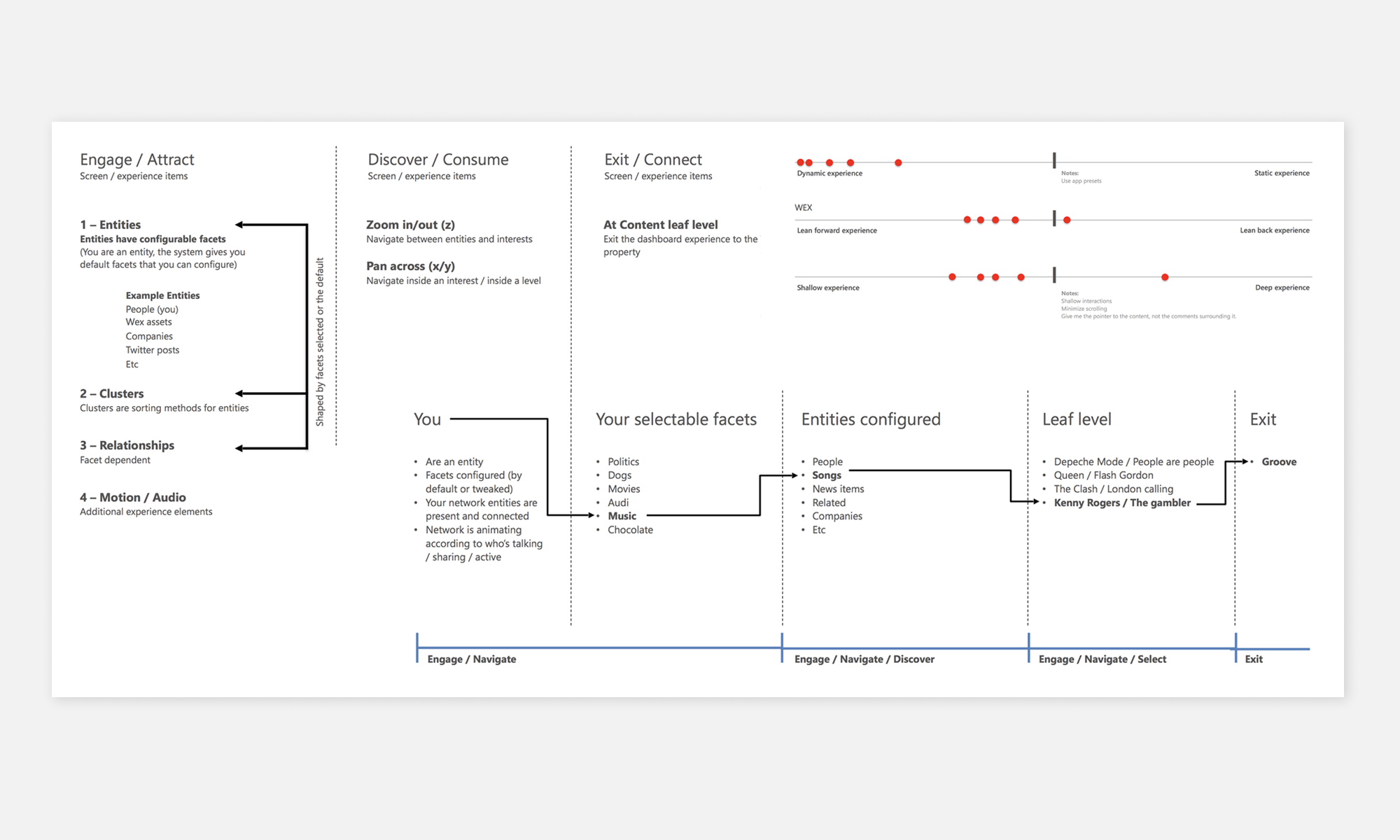
Following, I established principles, value statements, set the one-line concept, and defined the top 5 customer promises ➊ to set the creative vision and drive product design execution. This gave us what we needed to move to the next steps. I conducted experience framing workshops ➋ and defined the interaction types needed. With this in place I was ready to produce the high-level user flows and map the connections between the People app and the Microsoft Creator ecosystem ➌.

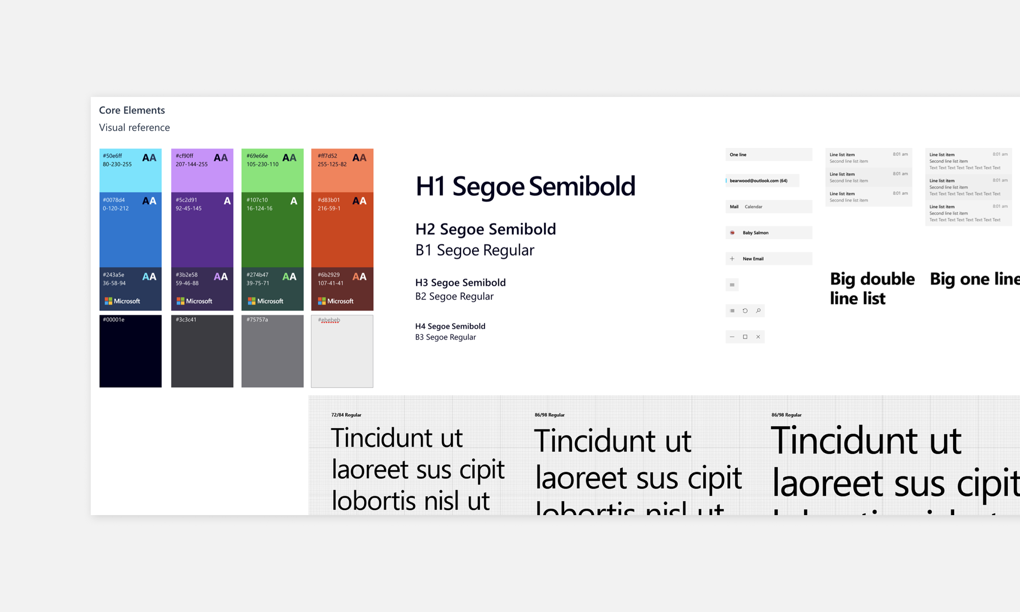
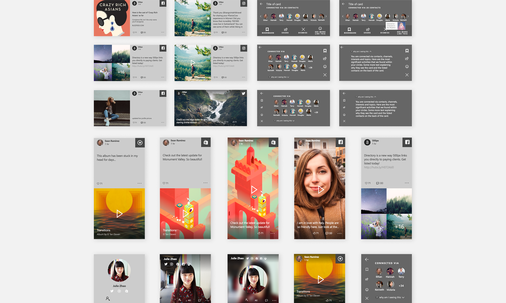
Designing and Building a System In parallel, I worked with the team on content structure by establishing grids, color palettes, typography hierarchies, ➍ layout rules, and content variations ➎ for a card model. We focused on personal identity, content sources, remixing permissions, and more.
Significant effort went into a clear design direction for representing various media types across viewports and platforms like mobile, desktop, and AR/VR, accounting for the user-generated nature of assets.
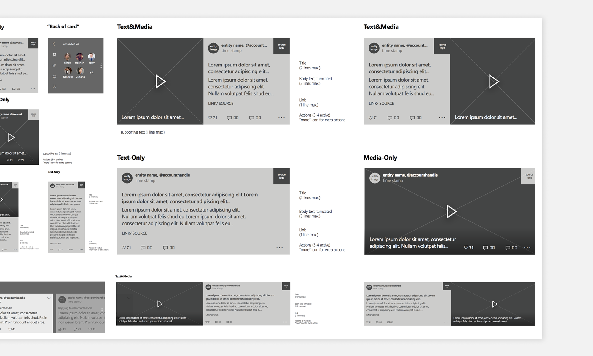

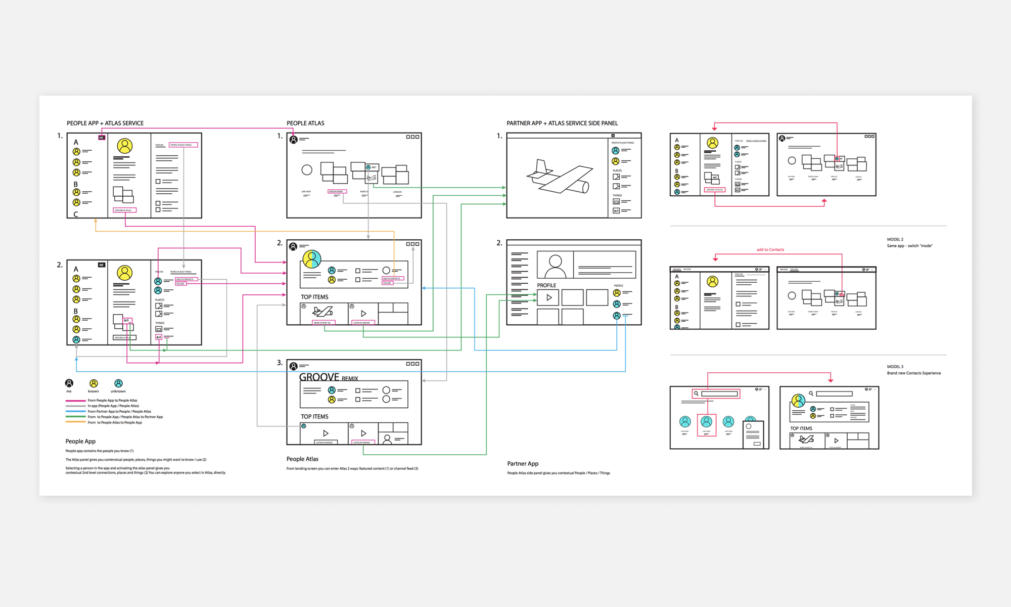
System AssemblyWireframes ➎➐ outlined the system's data infrastructure for the engineering team to start putting in place the code block structure. With card types, orientations, layouts finalized, we assembled and styled page layouts ➑➒ encompassing various states; from rest mode to browsing and auto-updates.
Close collaboration with developers ensured precise layout construction ➒➓ in preparation for user validation testing and the executive concept gate review.


TakeawaysWe delivered a successful concept, backed up by user insights that addressed all the requirements for success.
Having passed the Executive Concept Gate Review, we obtained approval and funding to produce the One-Line-Concept video (see above) to complement the functional prototype. This step marked the transition of the project from concept into production and underscored the project vision clarity and business viability.
1 picture = 1000 words.
1 video / 1 prototype = 1000 meetings.
The designed solution tested well, passed the executive concept evaluation, go/no go gate and we were able to build a great part of the proposed system.
Thesis validated:
Identity + expression = value.
Two 12-user positive qual tests.
Linked services prototype built.
System built to 80%.
Group reorganized, all Windows team reassigned to Office / Azure.