
The Microsoft Office group faced a challenge with their outdated customer stories testimonial site, experiencing declining engagement, traffic and conversion rates.
To address this issue, my team and I were engaged to transform the site by creating a new responsive template set within a tight four-week timeline.

Strategy and Planning
Project Management
Creative / Design Direction
IA/UX Design
1 UI Design
1 UX / UI Designer
1 User Researcher
1 Front-end Developer
1 Month
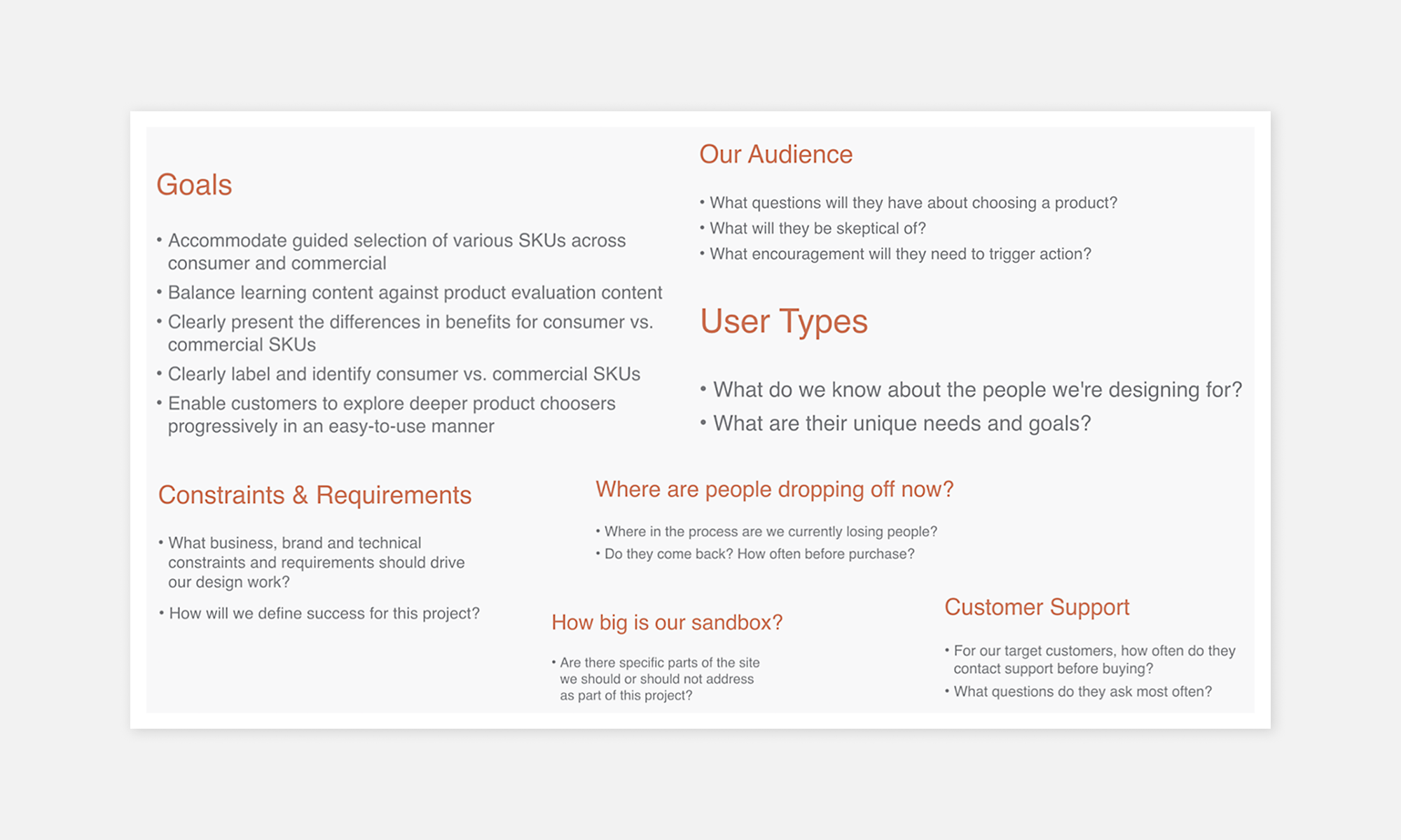
Defining Goals, Understanding CustomersI began the project with a thorough deep-dive session with the Office team to discuss goals, constraints, requirements, and success metrics. This was followed by gathering information about the target users, key use cases, and site benchmarks ➊.
A design plan and work-back schedule were outlined for the project stages: research, validation, design, development, and testing.
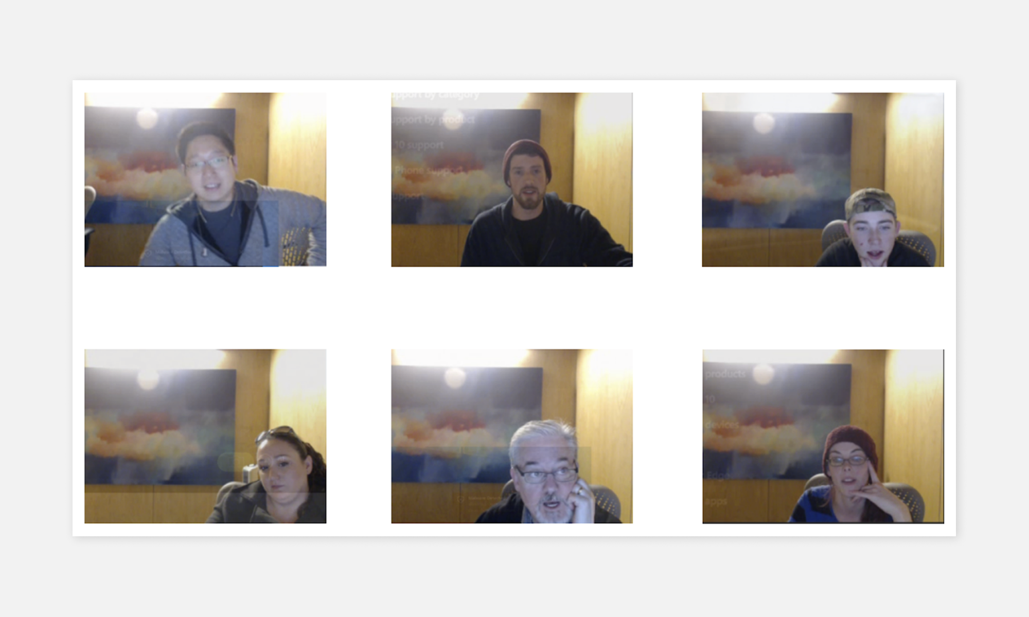
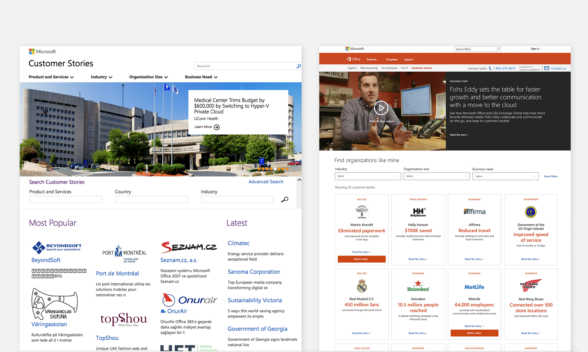
To gain a qualitative understanding of the existing site's baseline, a comprehensive, 6 session, task-based user research study was conducted. Users were asked to perform tasks on the existing site ➋, such as finding a vertical, identifying specific parameters in a customer, and downloading a case study.
By analyzing user feedback and behavior, a clear starting point for the redesign efforts was established, focusing on improving the search and filter experience, content structure, and quick learning summaries.
Improvement targets:
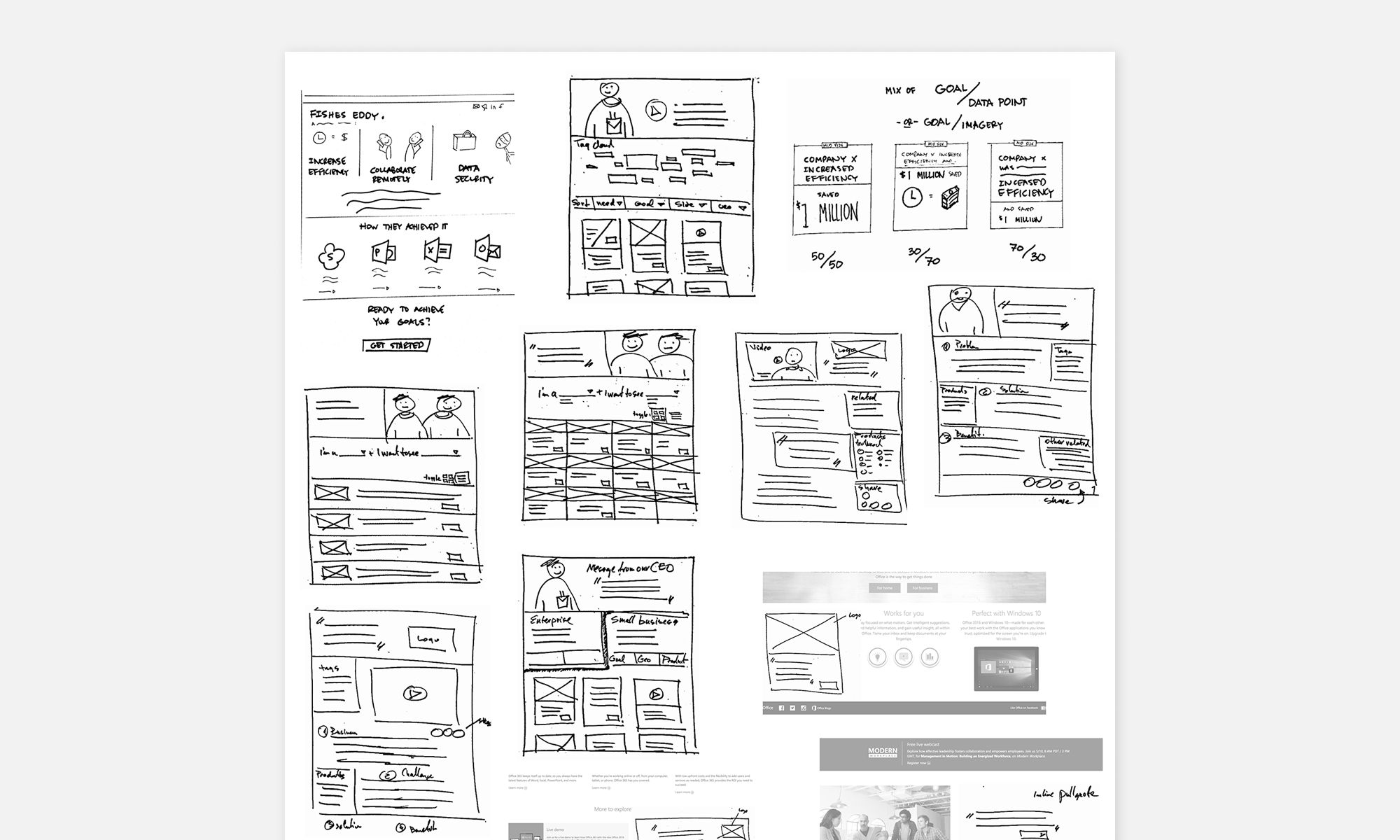
Interactive Pattern DefinitionWhiteboarding and sketching ideas ➌ with the team, based on user-informed feedback, provided clarity in selecting a direction.
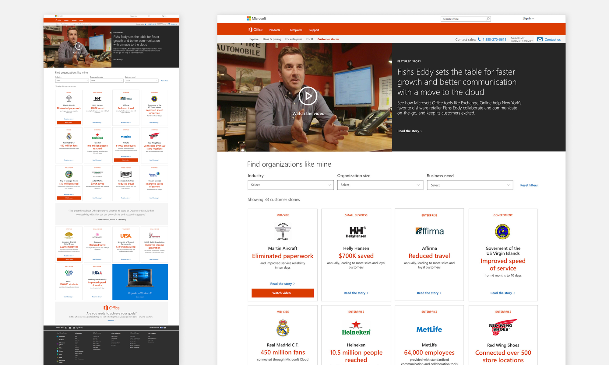
The result was a well-defined set of recommendations for moving forward and validating the design proposal. These included multiple search experiences, informational tile layouts, tag and sort content displays, tabbed displays of relational content, and better quote and image assemblies.
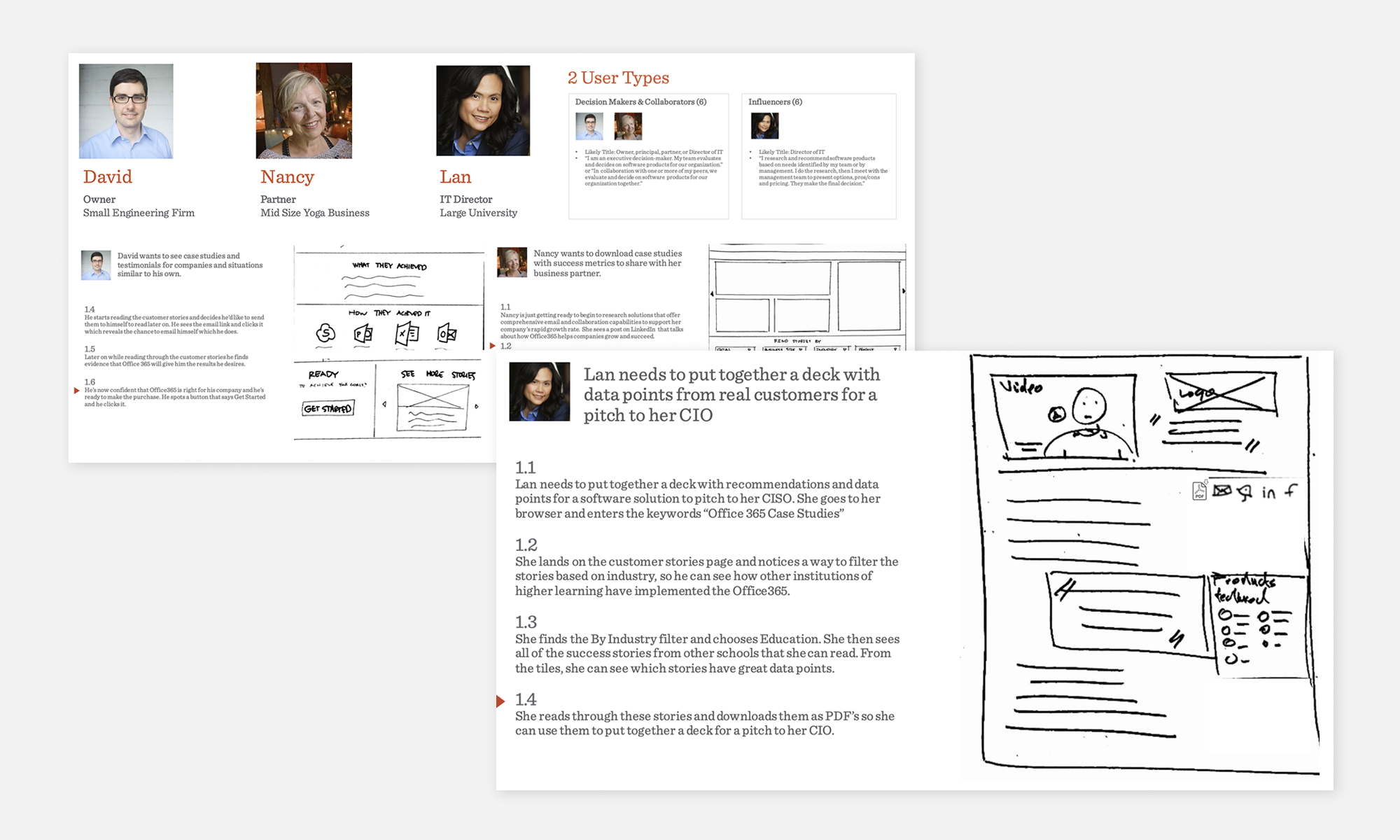
Next, we produced a prototype, using actual content from the website, mixed with the proposed direction sketches. Existing site navigation was paralleled with the new proposed interaction and content for concept validation ➍.
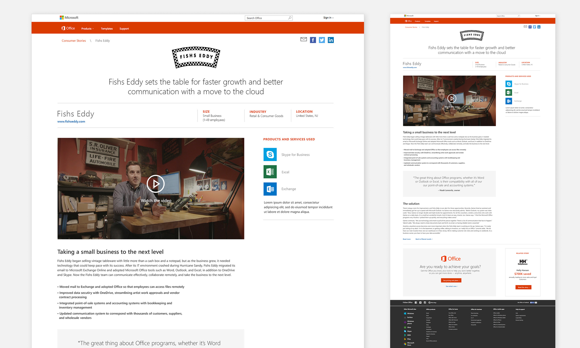
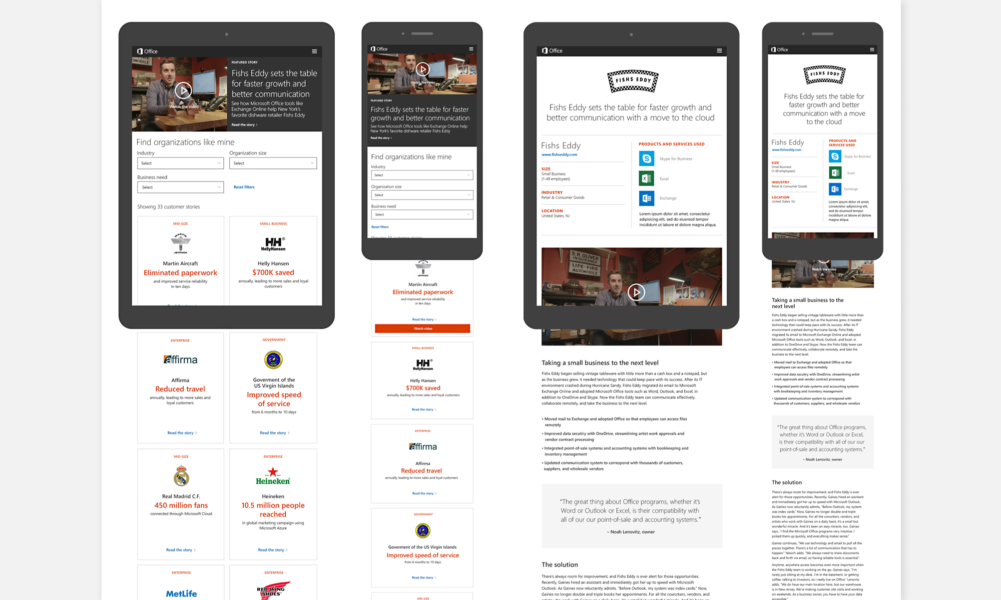
Design, Code, DeliverWith all the necessary data in hand, the team confidently transitioned to the design stage, enabling them to complete the layouts with minimal revisions.
Progress was expedited by using existing site content and leveraging Microsoft's MWF visual design system, tailored for the Office brand ➎➏➐.
TakeawayThe finalized and implemented design provided a significant qualitative leap for the brand ➑ and was well-received by both the audience and stakeholders, meeting the initial goals and metrics of the project.
Improved design and user experience resulted in significantly increased engagement and site traffic.
23.33% Increase in case-study downloads.
Pre-launch month:15,910 downloads*
Post-launch month:19,621 downloads*
* Stats provided by Pointmarc
Met tight timeline for delivery while maintaining high user validation and design quality bar.